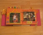
The Power of Scrapbook Color
Color coordination and contrast will highlight and accent your scrapbook layouts
Practical tips on how to harness the power of scrapbook colour for Success
- Experiment and Iterate:
- Organize Your Supplies:
- Consider the Viewer's Experience
- Final Thoughts
In this page we will explore the art of using scrapbook colors to elevate your creations and evoke emotions.
Colors are more than just visual stimuli; they carry emotions, convey moods, and tell stories.
In a scrapbook, the right color can transform a page from mundane to magical. Let's delve into the intricacies of selecting and harmonizing colors.
The Use of Color
The Use of the different Scrapbook colours depends on
- Theme and Mood
- Photo Inspiration
- Color Harmonies
- Creating Depth and Contrast
- Balancing Boldness and Neutrals
- Incorporating Patterns and Textures
- Personalizing Your Palette
How To Choose The Right Color For Your Scrapbooks
Before you dive into your scrapbooking project, it's crucial to understand the psychological impact of colors:
- Red: Passion, energy, love.
- Blue: Calm, trust, stability.
- Yellow: Happiness, optimism, creativity.
- Green: Growth, nature, harmony.
- Purple: Royalty, luxury, spirituality.
- Orange: Vibrancy, warmth, excitement.
Choose colors that align with the theme of your project. For a beach vacation, soft blues and sandy neutrals evoke tranquility and relaxation. For a birthday celebration, vibrant pinks and yellows bring out the festivity.
Your photos hold a wealth of color inspiration. Extract hues from the images themselves or choose complementary colors that enhance the visual impact.
Embrace color harmonies such as complementary, analogous, or triadic schemes. These harmonies create visual interest and balance.
Tints, shades, and tones are your secret weapons for adding depth and contrast:
- Tints: Adding white to a color lightens it, creating a softer shade.
- Shades: Mixing black with a color darkens it, imparting depth and drama.
- Tones: Incorporating gray mutes a color, providing subtlety and sophistication.
While bold, vibrant colors can command attention, neutrals play a vital role:
- Whites and Creams: Provide a clean canvas and highlight other colors.
- Greys and Browns: Add depth and grounding to your compositions.
- Blacks: Introduce drama and definition.
Patterns and textures add dimension and interest to your scrapbooking pages:
- Patterned Papers: Choose papers with complementary patterns to your color scheme for added visual intrigue.
- Embossing and Stenciling: Create tactile elements that interact with light and shadow.
- Fabric and Ribbon: Introduce textures that invite touch and elevate the sensory experience.
Tailor your color choices to reflect the essence of the memories you're preserving:
- Seasons: Capture the vibrancy of spring, the warmth of summer, the earthiness of autumn, or the tranquility of winter.
- Themes and Occasions: Customize your palette to match the mood of the event, whether it's a wedding, a vacation, or a milestone celebration.
Don't be afraid to try different color combinations. Sometimes, unexpected pairings yield the most captivating results.
A well-organized collection of papers, inks, embellishments, and tools will streamline your creative process.
Think about how your chosen colors will resonate with those who view your scrapbook. What emotions do you want to evoke?
In scrapbooking, color is one of your most potent tool for storytelling. It sets the mood, conveys emotions, and brings your memories to life. With a thoughtful approach to color selection, your scrapbook pages will not only capture moments in time but also evoke feelings that will be cherished for generations to come.
So, pick up your Scrapbook and let the colors recounts your memories! Happy scrapping!
Remember scrapbooking ideas is limited only to your own imagination. We are all unique and have different lives, careers, hobbies, experiences etc from others.
Capitalize on your uniqueness and turn it into your own unique scrapbooking pages.
Subscribe To Newsletter
All scrappy ideas
It keeps you informed about unique themed scrapbooking ideas, free layouts, Product reviews, supplies, tips, information etc.
Or you can even share your ideas, suggestions feedback etc that will help us improve our scrapbooking experience.


Recent Articles
-
Pet Scrapbooking Layout
Nov 11, 23 05:34 PM
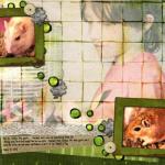 This Pet Scrapbooking Layout was inspired by St Paddy's Day and created to celebrate my son's new pets. I used Heidi Kuester's Lucky Lou page kit from
 -
Free Scrapbooking Layouts Templates
Sep 11, 23 03:37 PM
Get free Scrapbooking Layouts Templates like Baby scrapbook layout, Valentine scrapbook, Love layouts, Family scrapbooking, wedding... -
Scrapbooking ideas, tips to help you make a wonderful scrapbook
Sep 11, 23 03:12 PM
 Looking for scrapbooking ideas? Get all the exciting ideas,suggestions,tips and techniques for your Baby, Wedding, Military Personnel and Lots More

Scrapbook Contest
Win Huge Prizes participate in our Scrapbook Contest, It's easy and fun.

Related Pages


Affiliated Links